
Project goals
Establish the company as a pioneer in the new market niche of AR artwork;
Boost organic traffic and reach out to new demographics;
Drive sales within tech-savvy customers.
My role
Responsible for product strategy,
Research and UX design,
UI and Interaction design,
Specking and handling assets for production,
Quality management, and Test Flight of the builds,
Launch and Marketing strategy.
Formalizing the idea
Concept validation
Plotnet Prints is an official printing sponsor for San Francisco Design Week 2019. One of the printed posters on the exhibition featured an AR experience; so we set to observe the behavior of the visitors and got some early feedback and insights:
Users were a lot more engaged, spending almost 15x more time around an AR poster vs. a static artwork.
Users were positively surprised by an extra level of understanding of the artwork and found it educational.
Users felt a stronger connection to the artist and the piece.
Field research
After initial concept validation and with approval from stakeholders to proceed, I’ve reached out to a few long-term Plotnet Prints partners that are experts in the AR field: Transparent House and Aemass. After several brainstorming sessions the following ideas and concepts were developed:
Plotnet Prints is uniquely positioned to use AR as an extension to their product, providing real value for customers. This is what sets this business case apart from many companies that struggle to justify commercial AR applications as only an advertising tool.
Identify an opportunity to provide value for the customers that are in exploratory mode and haven’t bought a poster yet.
Native app over WebAR. Multiple technological constraints of the current state of WebAR doesn’t allow us to implement it directly on the website in the way we need it to.
iOS over Android. We took into account Google Analytics data from Plotnet Prints website about our mobile customers; differences in customer demographics and income levels; robustness of Apple ARkit and costs of deployment on both platforms.
Possibility to remotely update the AR experience creates a unique and unobtrusive marketing channel while providing value for customers.
Make digital AR experiences ownable by requiring a certification code to unlock AR. Maintain the exclusive access for customers that own a physical piece more valuable.
Unity over UnrealEngine. Deployment costs and project applicability.
Challenge of offering AR on vertical planes: monochrome walls provide additional challenges for the AR system to recognize suitable surfaces for poster preview.
Custom-built AR experiences can create a stronger bond between the artist, customer and Plotnet Prints brand.
App Architecture
Modal concept for Plotnet Prints
Based on the features map shown above I have created an MVP App Architecture that would keep all the core components yet minimizes the development costs. Using Modality helped to achieve that goal and here are some of the findings I have identified along the way:
1. Modality creates a structure of the application that allows for free exploration with occasional focus tasks.
2. It makes it easier for the user to keep a mental model of the app in mind, which calls for a superior user experience according to Marty Neumeier in the book Brand Gap
3. It helps to optimize and structure the development process by “core elements” and “features”.
Project considerations
When rolling out a new product on the market, it’s wise to create a Minimum Viable Product (MVP) and test it on the market to see if the concept will fly. At Plotnet Prints, we have approached it by creating a road map of the app development that will start with core functionality and then build up additional features if the product is a success.
An MVP approach aimed at keeping development costs to a minimum has brought up the following design constraints:
use of native iOS components, behaviors and modal dialogs. Use icons and symbols from SF Pro text typeface.
keep the use of animations and custom interactions to a minimum; use flat layouts and clean, on-brand UI
optimize the app structure around the core components with the flexibility to add features later in the subsequent builds.
include onboarding tips in the appropriate dialogs thus eliminating the onboarding section in the app.
Gallery view & Upcoming collection
On the main Gallery tab, the user can explore all the posters from past and current collections. Posters that feature AR experiences are marked with ARkit symbol.
Scrolling down the Gallery view, the user can have a sneak peek of the Upcoming collection and Subscribe for the Upcoming release newsletter to secure one of the first editions at a lower price.
Favorites and Filters
In the NavBar, the user can Filter Gallery posters based on the availability of the AR experience or display only those that he may have marked as Favorites in advance. In the case, if no posters are marked as Favorites yet, the user will be guided with an explanatory message.
Filters work independently and allow for faster and more flexible navigation through the Gallery for Power users.
Poster view
Once the user taps on any poster in the Gallery view, modal dialog with a Poster view slides in over the Gallery view. In that modal dialog, the user has multiple ways to experience the artwork.
Each poster has multiple interior mockups that the user can go through in a carousel fashion by tapping on the right half of the image to go forward and on the left side — to go backward.
In this view, there is an option to add the artwork to Favorites for faster access in the Gallery view as well as share that particular poster via a standard iOS sharing dialog.
“Try it on your wall” button allows the user to place the poster on the wall in AR mode to test how it fits in their interior, snap a picture of the setup and share with family or friends for approval.
Poster description is designed as an intuitively scrollable card, yet some members of our target audience may not be familiar with recent UI trends. An information icon gives a hint for more details about the artwork. When the user taps on the “info button”, the card scrolls up revealing poster description, information about the artist as well as available editions and its current price. There is an option to purchase the poster right from the app via a web view of the site.
AR Experience
First time user of the AR mode is presented with the helpful navigational tips that can be accessed later on by tapping on the “question button". Once the camera located and recognized a known artwork in the Interior, user prompts to input a certification code that he can find on the back of the poster or on a Certificate of Authenticity that is mailed separately from the artwork.
By introducing this verification step we make digital experience ownable, thus raising the value of the artwork the customer has purchased. The code is stored on the device and is not required for subsequent uses.
If the user didn’t buy a poster yet and wants to see how this feature works, he can opt for a sample video that will introduce the AR experience.
We are excited to help bridge the gap between analog and digital worlds, offering the next level of art experience.
Behind the scenes
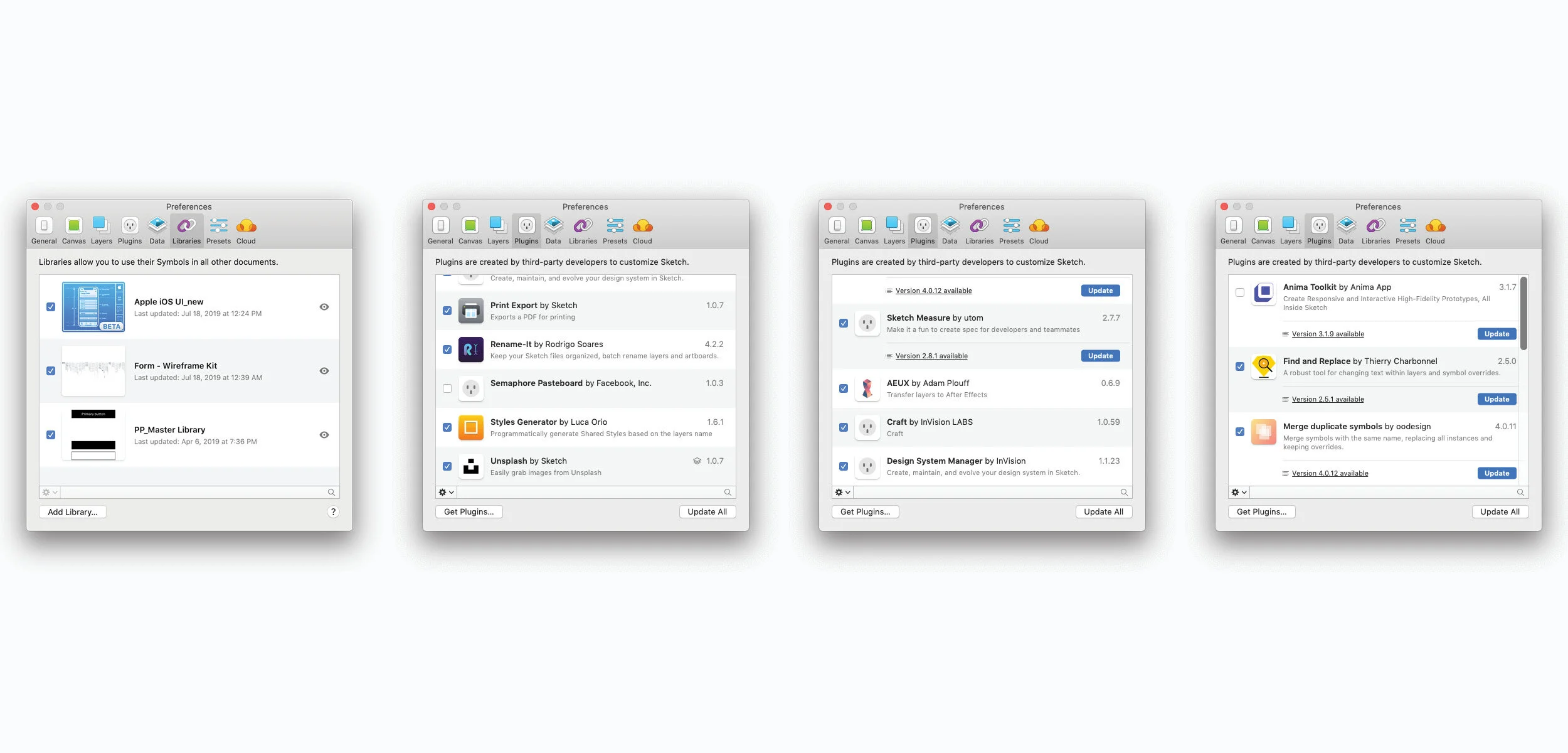
Sketch + Invision + Plugins
1. Craft plugin from InVision to create and share prototypes + publish freehand board for developers and stakeholders to comment
2. Craft Data to easily populate symbols with live poster designs
3. Forma wire-framing kit from InVision
4. Apple iOS 13 components library
5. Custom Plotnet Prints components library with all the brand assets I’ve built designing their e-commerce platform
6. Style Creator plugins, Symbol cleanups, etc

Accessibility
Colour Contrast Analyser (CCA) is a standalone application for Mac OS that helps to test any two color combinations for WCAG 2.1 compliance.
For the project that is using lots of semi-transparent elements I was aiming for slightly higher standards that could hold in the extreme cases of the background color choice.

Prototyping with Craft
Craft and InVision prototyping helps to build complex prototypes on the fly by designating specific transitions in the symbols and then reuse symbols to save time.
Purple lines are transactions designated in the symbols, so all tab and nav bars follow the same pattern; while blue lines are custom interactions and are not repeatable.
Presented artwork is part of the Community exhibition from San Francisco Design Week 2019.
Featured poster and animation are designed by Mucho. Interior mockups are courtesy of Anthony Boyd graphics.